Freehand, a lesson in intuitive design
- screamindesigns25
- Nov 7, 2025
- 2 min read
Updated: May 1
Freehand was a project from early in my career that gave me a critical lesson. In my early years, I worked for a packaging innovation firm called Perimeter Brand Packaging. Our focus was driving packaging innovation and creating value adding features that would make every day items easier to use. When I began working on freehand it had four major issues; it was four separate injection molded components(expensive to tool, produce and assemble), it wasn't very accurate, the aesthetics weren't great and most importantly, it was not intuitive.
I could probably do a detailed story on fixing all of those items and the lessons learned, but for this story we'll stick to the most important; the intuitive use issue.
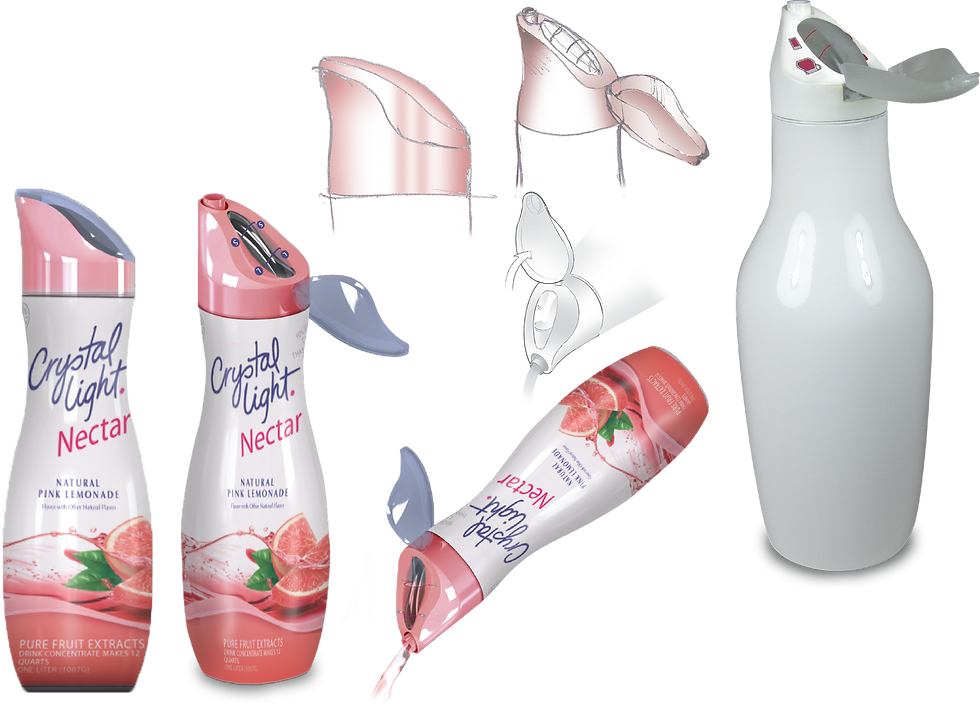
Freehand worked on a principal of proportional fill. Inside the unit were three holes. Two would lead out the spout for dispensing and the third would go into an indicator window displaying how much had been poured when the bottle was tilted. When returned to a vertical position, the indicator would drain resetting the system.
Problem one was getting customers to understand what it was. Management thought the existing prototype could work if we could create instructions that were simple and easy. After conducting consumer testing, it became clear that no matter what brilliant and simple graphics we put on the bottle, consumers would never look at them until they failed first. At that point, it was already too late, they hated that it made them feel stupid. The customer would have already tilted the bottle a few times, saw the indicator fill and THEN open the cap getting detergent all over their hands.

Freehand 2.0
The solution looking back was obvious. Keeping the customer from viewing the indicator before opening the cap would prevent the mess and embarrassment. The second step was making sure the indicator was a dominant design element and making sure it was easy to read. Once we began sketching the new direction, we were able to integrate the cap and merge the two inner parts into one cutting the part count in half.
Two versions were created, one for a new Method 10X concentrated detergent and one for Crystal Light Nectar drink mix.

Learnings
The key learning from this early project is that if a product isn't intuitive and easy to use, it's not going to succeed. I have taken this forward in every project I've worked on in the many years since. People do not read instructions and it doesn't take much to push them away from a product.
In the end, while we were able to fix the intuitive issue, improve accuracy 25%, improve aesthetics and reduce the part count and cost. Unfortunately, the economic issues in the aftermath of 2008 and some upper management issues kept this from being a commercial success. Still, I'm really proud of the work we did and the takeaways going forward led to many much more successful product launches.

Comments